Why I love the Square Photo Format
Since I started to use the photo sharing app Instagram and Hipstamatic, I fell in love with the square photo format.
A little trivia: The love for the square photo format was also the name giver for my blog. Squics is a coinage of the first three letters of square and the last three letters of pics. Not that this was very creative, but everything else was taken ;)
A Little History of the square photo format
Square format photos are not new but this format came into focus again with mobile photo apps like Instagram or Hipstamstic. One of the first cameras that took square format photos was made by Rollei in 1929 and since then the square photo format was used in e.g. toy cameras like the Holga and in professional camera gear like those from Hasselblad.
The square photo format is simple and balanced
The main reason I became a fan of the square photo format is its simplicity and balance. Unlike portrait and landscape 4:3 formats, where the eye is either drawn from left to right or from the bottom to the top, the square photo format draws the eye to the center and then lets the eye explore the entire frame without providing any implicit direction because of the frame. That provides a number of additional options when composing a photo.
Moreover, I like the square photo format because it helps me to remove the superfluous without harming the overall composition and I found this format works quite will for my kind of photography like landscapes, cityscapes and lost places.
Square format composition
I feel that using the square photo format gives me more freedom when composing a photo. There are different opinions out there, but I do believe that the rule of thirds is still a valid way to compose images in square format - with additional options that may not work well when using a 4:3 or even 3:2 format. As a reminder, the rule of thirds basically suggests to place the main subject at the intersection of the grid lines that separate the frame in three sections horizontally and vertically.
Shooting landscapes in square format
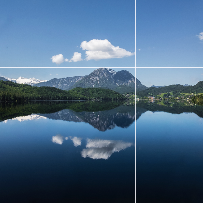
In the following two photos I aligned the main subject inside the center square(s). For the first photo that I took at a lake in Alt Aussee, Austria, the main subject is the mountain plus the reflection in the lake.
The second shot shows Skogafoss waterfall in Iceland which I also placed inside the center squares. Cropping this one to square format removes the unnecessary rocks to each side of the waterfall and the direction of the water (typically downwards ;) leads the eye to the small person in front of the waterfall, which I placed in the center bottom square to illustrate the size of the waterfall.
Center composition using the square image format
As the main subject in the next photo, the Golden Gate Bridge, is actually in the background, I placed it in the upper right intersection of the grid lines and used the beach and the waves as a leading line to guide the eye towards it. The line created by the waves runs almost in a perfect diagonal through the lower left and middle square of the grid lines.
Again, using a 4:3 format for this photo would just add either more rocks on the right or more water on the left which I felt is an unnecessary addition as the main subject is the bridge.
Cityscapes and the square photo format
The square photo format works also great for cityscapes and architecture. In the next shot of Big Ben, London, I put the main and big subject along the right line of the grid and added the street lights in foreground in the lower left squares. This composition creates a nice diagonal across the center square that guides the eye from the lights to the clock of Big Ben (or the other way round)
The next shot is the one I originally wrote this blog post about. I placed the main subject in the middle, filling almost all the squares, leaving a little empty space in the upper left square. Using the original shot in 3:2 format would just add some more sky, which does not really add anything to the photo.
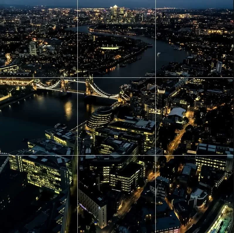
And finally, one more shot from London. The main subject here is Tower Bridge. So I placed it at the upper left intersection of the grid lines with the river running through the upper middle and middle right square.
Lost places and indoor photography in square format
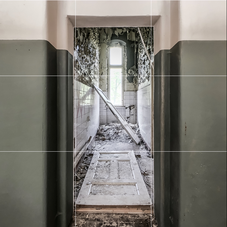
My third area of photography are lost places. And as for land- and cityscapes, the square photo format works quite well for photographing the interior of lost places. Here is a shot I took inside a lost place in Beelitz, near Berlin.
It’s a shot of the movie set of the film A cure for Wellness. The entrance to the room with the door on the floor is placed exactly along the two vertical grid lines and the door in the lower square.
How to shoot in square format
All iPhone camera apps I use have an option to enable shooting in square format. However, if you’re just getting started shooting in square format, at recommend to shoot in 4:3 landscape format first and then experiment with cropping your photos to square format.
Once you’re comfortable with this format, use the built in iOS camera app or ProCamera and switch to the square photo format for shooting.


